49th Shelf Book Lists
HTML · CSS · UX
49th Shelf is an online database of Canadian books, writers, and publishers. The audience for the site includes consumers, teachers, librarians, book store employees, publishers, and others.
The core building block of the site is the book listing. Individual book listings consist of a book cover image and different meta data related to the book. The same design component is also used to link to lists of books, and award listings.
Two of the main principles that guided the redesign of the site were:
- to reduce UI cruft and present the interface in a clear, logical manner
- to feature book covers, wherever possible, in larger and more compelling sizes
In the design brief, a stated desire was to re-create a sense of browsing as if in a bookstore, and we wanted to achieve that without relying on skeuomorphic cues like wooden shelves or 3d environments—reducing UI cruft, in other words.

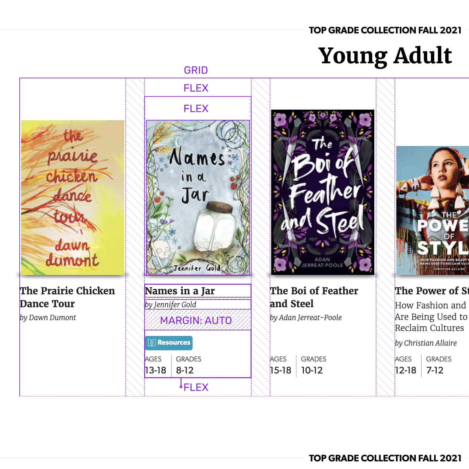
The book listing container is a contextual wrapper for the book modules and sets the max-width and margin for the listing group. It contain a header and a parent container for the list. The class section-six-up has the CSS grid rules for the listing.
<section class="section-book-list">
	...
	<div class="section-six-up">
		...
	</div>
</section>
In this case the section-six-up class creates a six column grid of equal widths for the listing. Four and eight column grids are also options, as seen above. Flexbox could also be an option for this layout, but grid is more reliable about widths and also much better about multiple rows, if needed.
.section-six-up {
	display: grid;
	grid-column: span 8;
	grid-column-gap: 2rem;
	grid-row-gap: 2rem;
	grid-template-columns: repeat(6, 1fr);
}
To create a sense of a shelf or plane, the books are aligned to each other by the bottom edges. Covers are sized at 100% of the width of the image container, and the aspect ratio dictates the height of the cover. This creates some variety in the display. Initially we wondered about how books of disparate trim sizes (like children's picture books) might appear in the display, but the grid seems to handle them pretty well.
The individual listing uses display: flex to divide the image and copy into two containers. Each image is pinned to the bottom of its container, again using display: flex and also align-items: flex-end.
<a class="module-promo" href="#">
	<div class="module-promo-thumb">
		<img ...>
	</div>
	<div class="module-promo-copy">
		...
	</div>
</a>
.section-book-list .module-promo {
display: flex;
flex-direction: column;
}The shadow below the book reinforces the sense of a plane that the books sit upon. The shadow is actually a combination of two elements: a box-shadow on the book cover and an empty :after pseudo-element that creates an additional shadow that extends right and light of the bottom edge.
When the cursor hovers over the book listing, the shadows change as the book rises above the surface. The box-shadow on the cover stretches from the raised cover to the plane, and the :after shadow becomes wider and softer, again to show a relationship to the ground plane.
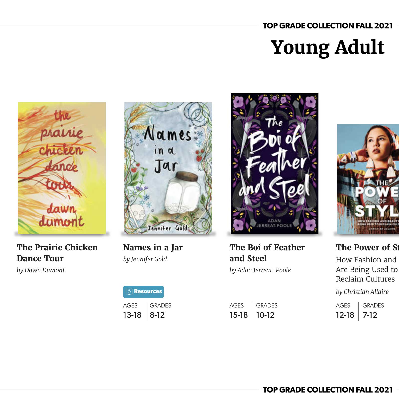
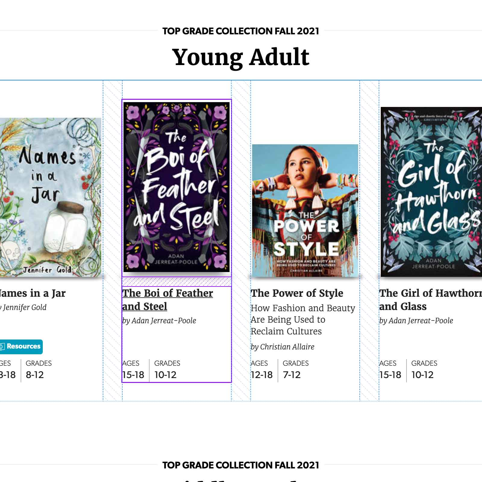
The final piece of the book listing is the title and author information that appears below. In the first iteration, the information was simply flowed in order below the book jacket.
When the design system was expanded to include the 49th Kids site, additional information about grade and age recommendations was added to each listing. After some thought it was decided that it was easier to scan this grouping if it was aligned to the bottom of the grid row. To achieve this, the information container is made display: flex and the grade and age grouping is pushed to the bottom using margin-top: auto.
The take-away from this work, for me, is that flexbox and grid are remarkably usable in current browsers. A lot can be achieved with a few lines of css, and encapsulating flex within flex within flex within grid is a perfectly good way to arrange and align content in a (relatively) predictable manner.
To see the book lists in action, visit the 49th Shelf site.